
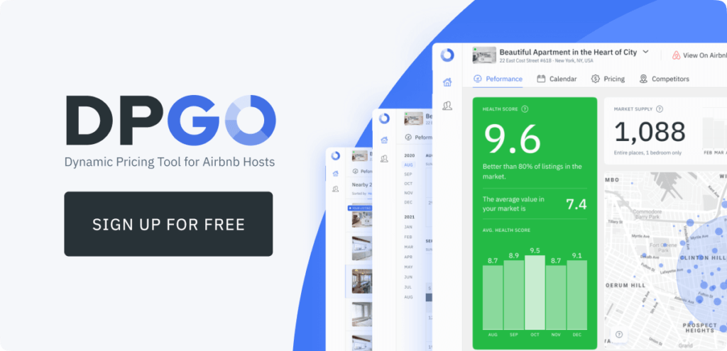
We love our Performance Dashboard. It took rounds of development to get it to where it is today. We consistently receive great feedback from our users about the Performance Dashboard. Not to mention the amount of data displays that we’ve included.
In this post, we’ll explore the following widgets – Revenue, Revenue Trend, Market REVPAR, Market Lenght of Stay, Average Market Length of Stay, Average Lead Time, Amenities, and Lenght of Stay vs Lead Time.
This is the final post of a four-part series where we explain
Part 1 shows Market Rental Size, Market Rental Type, Average Price, Average Daily Rate, and Base Number of Guests.
The Performance Dashboard Explained Part 2 includes an explanation on Occupancy Rate, Future Occupancy, Market Pricing, Day of the Week Occupancy, and Occupancy Trends.
Part 3 shows Cleaning Fees, Extra Person Fees, Cancellation Policies, Bookings, Cancellations, and Bookings vs Lead Time.
Performance Dashboard Widgets Continued…
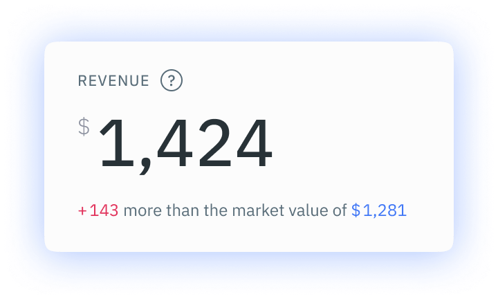
Revenue
Revenue is a great indicator of business and market success and viability. Our Revenue widget displays the median market revenue earned over the past 30 days. This figure does not include taxes, services like Airbnb, or extra guest fees. We did not include Cleaning Fees in this market revenue figure. We’ve included so many revenue-based widgets in the Performance Dashboard that we decided we needed greater representation for the wider market.
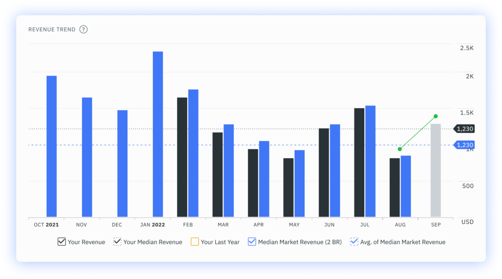
Revenue Trend
The Revenue Trend widget shows the trend that’s created when we compare the total listing revenue for a given month with the median market revenue for similar listings. The previous month display shows the forecasted revenue for the current month. You can select to display the following things on your Revenue Trend widget: your revenue, your median revenue, your last year, median market revenue, and average median market revenue.
This widget can show you a range of things, but mostly it’ll help you ascertain how your revenue is faring against that of the local market.
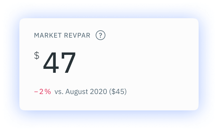
Market RevPAR
Market RevPAR refers to the revenue per available room. Our Market RevPAR widget shows the median revenue from the period in question divided by the total number of rooms available in your market over the past 12 months. It shows how well the market is performing in terms of bookings. The higher the RevPAR, the better the performance.
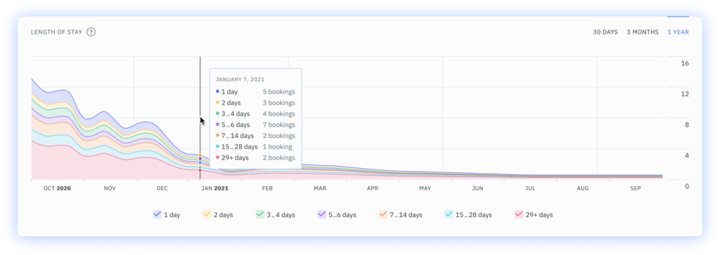
Length of Stay
The Length of Stay graph is a great tool for short-term rental hosts because it shows them how long visitors are opting to stay in their rented accommodation in your local area. We’ve divided it into various time periods – 1 day, 2 days, 3-4 days, 5-6 days, 7-14 days, 15-28 days, and 29+ days.
This graph just shows you how prevalent certain stay lengths are in your market. You can change the graph to view different forecast lengths. You can view a 30-day forecast, a 3-month forecast and an annual forecast too.
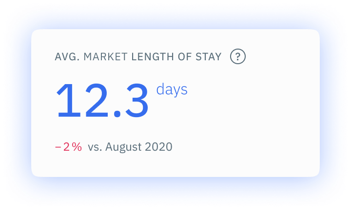
Average Market Length of Stay
Our Average Market Length of Stay widget takes the bookings from your local market over the past 90 days and works out an average stay duration. We’ve also included a comparison with the same period in the previous calendar year. This will show you how the market has changed after just 12 months. Obviously, the pandemic has affected these numbers but it’s still a helpful insight into the health of the market.
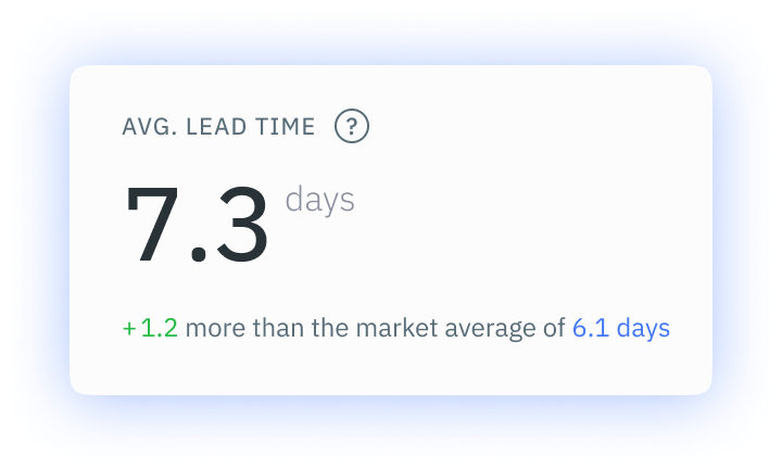
Average Lead Time
We remember tracking a data trend early in 2021 which saw guests opting to book their accommodations later and later. The lead times were getting smaller and smaller as the year went on and industry stakeholders put this down to the fact that people wanted to avoid the possibility of disappointment and financial loss.
The Average Lead Time widget shows the average number of days that elapse between the date of booking and the check-in date from bookings in the past 90 days. This widget shows data pertaining to your listing specifically, rather than that of the greater market. We do give you a comparison statistic below the widget which will contrast your average lead time with that of your local market for the same period.
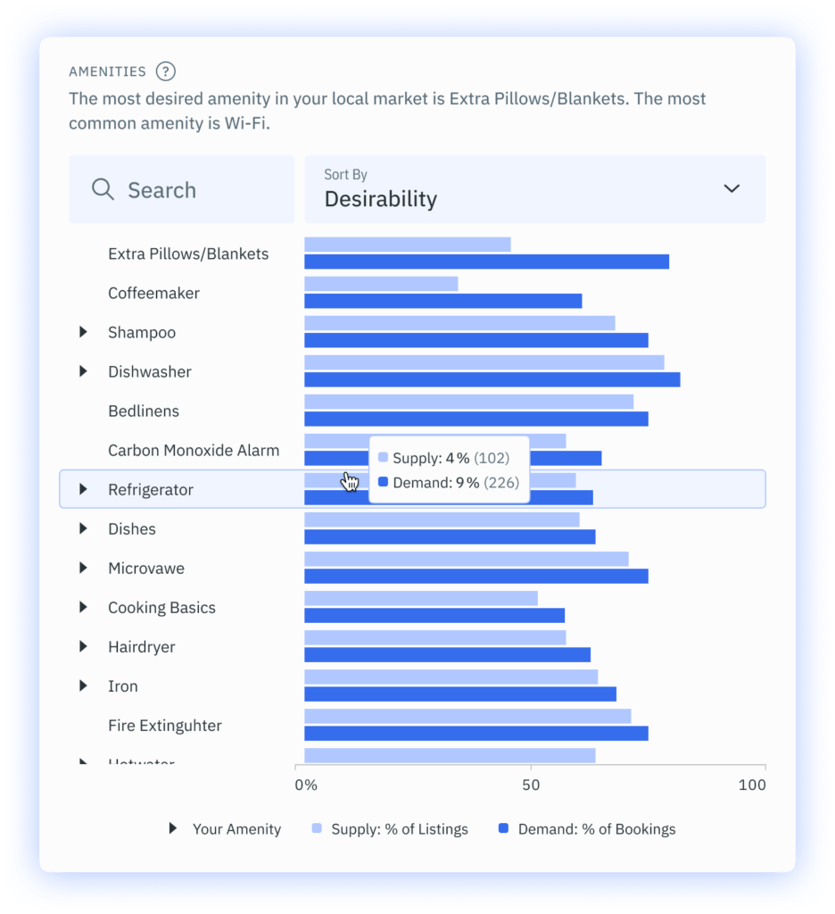
Amenities
Amenities are very important for guests. If they have certain things at their homes, they will likely expect the same amenities, if not better. While you cannot forecast what specific guests will expect, you can compare your listing to those of your competitors. Then you’ll be able to see if you’re offering the same amenities.
Our Amenities widget is separated by amenity type. You’ll be shown supply and demand, as well as which amenities you’ve listed on your profile. We calculate the supply by analyzing how many competitor listings in your market offer those specific amenities. We calculate demand by looking at the amenities of listings that had confirmed bookings over the last 100 days.
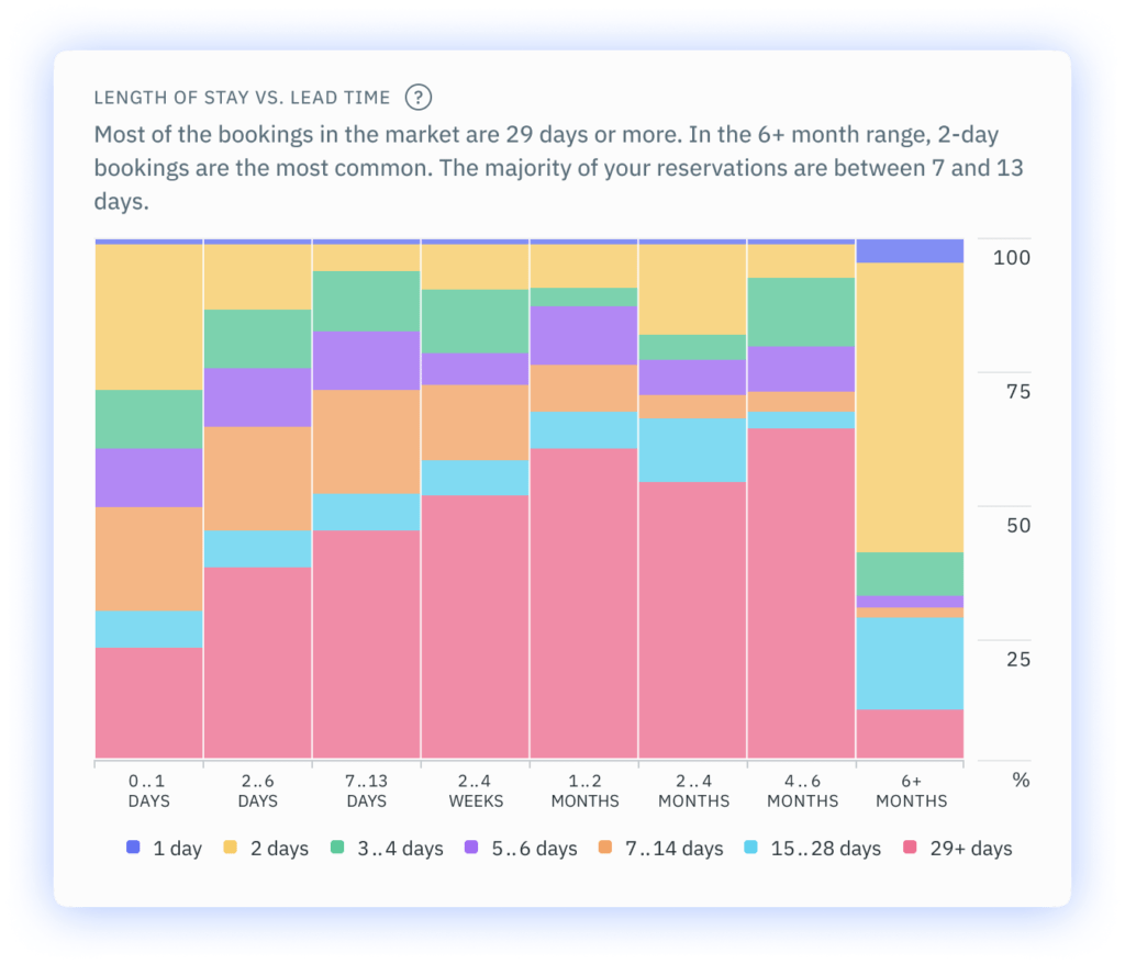
Length of Stay vs Lead Time
Our Length of Stay vs Lead Time widget shows the relationship between the length of time and lead time in bookings from the past 30 days. We’ve labelled the graph with the percentage of prevalence and lead time. The colours show the stay duration. We know that this is a lot of information all at once, but it’s easy to understand once you know what you’re looking at.
In essence, the widget shows you how much lead time hosts in your area get for bookings of varying duration. You can use this information to forecast booking trends and better understand the behaviours of your client base.
How Can I Access the DPGO Performance Dashboard?
We offer a range of payment options for our users! So, head to our website now to see which plan is right for you! Register for DPGO now by clicking on the banner below and creating your account! We’re offering all new users a free 30-day DPGO trial to experience the benefits for themselves!

Comments are closed.