
We love our Performance Dashboard. It took rounds of development to get it to where it is today. We consistently receive great feedback from our users about the Performance Dashboard and the amount of Airbnb data displays that we’ve included.
In this post, we’ll explore the following widgets – Occupancy Rate, Future Occupancy, Market Pricing, Day of the Week Occupancy, and Occupancy Trends.
You can view both the original Performance Dashboard post and the first in our new series here.
Performance Dashboard Widgets Continued…
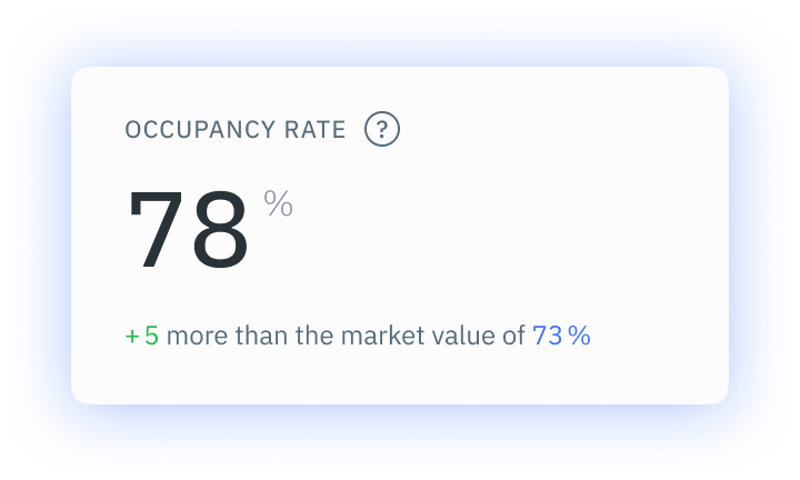
Occupancy Rate
Occupancy Rate is a wonderful indicator of listing health. We calculate your Occupancy Rate by taking the average number of booked days divided by the total number of available days within the past 30 day period. It show shows you how busy your property is and displays it in a percentage format. We’ve also included another insight at the bottom of the widget too by telling you how your listing compares to the greater market and by what percentage.
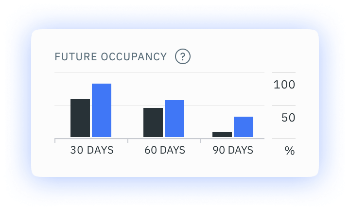
Future Occupancy
The Future Occupancy widget is a comparison between your listing and the market for the next 30, 60, and 90 days. Not only does this show you how your listing is booking out for the next three months, but it also shows how your booking pace compares to the rest of your local market. If the rest of the market has a higher percentage of bookings over the three graphs shown, it does not necessarily mean you need to lower your prices. In fact, if you stand firm and keep your prices in place, you may end up earning far more than your competitors.
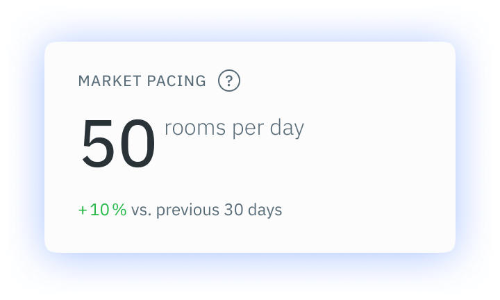
Market Pacing
Market Pacing is not the simplest of widgets to explain. In short, the widget shows the average rate at which bookings are made in your market for dates that fall within the next 30 days. It is displayed in the number of rooms booked per day, and we’ve included a comparison percentage to the previous 30 days. This widget will show you if the market is becoming more or less popular and you can adapt your pricing accordingly.
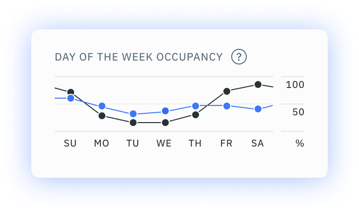
Day of the Week Occupancy
The Day of the Week Occupancy widget shows the occupancy rate for each of the seven days of the week. We collect this data from the last 91 days and use it to calculate both your occupancy per day of the week and that of the greater local market. We use 13 weeks’ worth of booking data to ensure that we give you a greater scope view of the market so you can best understand the patterns.
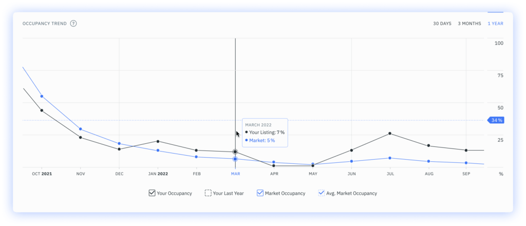
Occupancy Trends
Occupancy Trends is one of the most illustrative graphs on our Performance Dashboard. It shows the number of booked days divided by the number of bookable days in a one-month period. We don’t include blocked dates in this analysis. How can you use this information? Well, we’ve deliberately included four viewing options. You can see your currency occupancy, the occupancy rates from your previous year, as well as the market’s current occupancy, and the market’s average occupancy rates. By giving you a comprehensive view, you can ascertain if your occupancy rates are higher or lower than that of the greater local market. If you’ve fallen behind, you can use all of the insights in the Performance Dashboard to boost that occupancy rate and your associated profit!
How Can I Access the DPGO Performance Dashboard?
Sign up for DPGO now by clicking on the banner below and creating your account! We have a range of payment options, and a few free features too, plus a free 30-day trial to help you experience the effects for yourself!
Comments are closed.